
前回に引き続き、猫カフェトップページを、PC用のCSSを使ってスマートフォン用のデザインに修正します。
スマートフォン用CSSファイルのデザインを編集
「ご利用案内と料金について」のレイアウトとデザイン
背景画像と文章の位置調整
#cont-3>div>p{
        width: 100%;
    /* margin: auto; */
    /* padding-right: 420px; */
        padding: 65% 5% 40px 5%;
    /* padding-bottom: 40px; */
    background-image: url(../images/txtimg_2.jpg);
    background-repeat: no-repeat;
        background-position: center top;
        background-size: 90% auto;
}
「vhが万能じゃない説」
画面の高さが異なると、vhの大きさも変わります。
今回のように、背景画像をpaddingで表示しながら、文章の位置を決める時に出てくる問題です。
動画のように、うまくいかない時は「%」で試してみましょう !
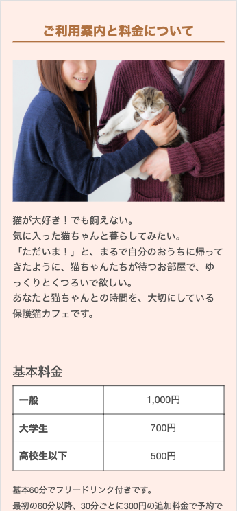
縦方向のパディングを「%」で設定する時の基準(ベース)は、親要素の幅になります。
親要素の幅が100%となるので、横幅の可変に合わせて縦幅が変わるような、今回の背景画像と文章のレイアウトでは、パディングは「%」で正解です。
リード文でも同じですが、あれは高さの100vhが基準になっているので、パディングを「vh」にしてもそこまで問題にならなかった。ということですかね…
Flexの2カラムを1カラムにレイアウト変更し、左右の余白調整
#info-container{
    /* padding-top: 30px; */
        padding: 30px 5% 0 5%;
}
#info-item1,
#info-item2{
    width: 100%;
}
「営業時間・交通アクセス」のレイアウトとデザイン
背景画像の非表示と余白の調整
#open{
    display: block;
        padding: 0 5%;
}
/* #open>div{
    background-image: url(../images/illust_5.png);
    background-repeat: no-repeat;
    background-position: 20px top;
    background-size: contain;
    padding-left: 120px;
} */
#open p{
    margin-bottom: 10px;
}
#access-container{
    padding-top: 30px;
}
#access-container div{
        width: 100%;
        padding: 0 5%;
}
「お知らせ」のレイアウトとデザイン
写真のサイズ調整と余白の調整、ページ内スクロールの表示
#cont-5 dl{
        height: 400px;
        overflow-y: auto;
        flex-flow: row wrap;
    justify-content: space-between;
        padding:0 5%;
}
#cont-5 dl div{
        width: 100%;
    display: grid;
    grid-template-rows: 40px auto;
        grid-template-columns: 1fr 30%;
    column-gap: 20px;
    border-bottom: 1px dashed rgb(180,180,180);
    padding-bottom: 10px;
    margin-bottom: 30px;
}
#cont-5 dt{
    font-size: 14px;
}
#cont-5 dd:first-of-type{
    grid-row: 2/3;
    grid-column: 1/2;
}
#cont-5 dd:last-of-type{
    grid-row: 1/3;
    grid-column: 2/3;
}
#cont-5 img{
    /* height: 142px; */
        aspect-ratio: 1/1;
    object-fit: cover;
    object-position: bottom center;
}写真を正方形にする方法で、アスペクト比を使いました。
aspect-ratioプロパティを使うと簡単にできましたが、相対単位の時に使うといいでしょう。
ページ内スクロールは前にも紹介していましたが、使うのは今回初めてです。
heightで高さを指定して、overflow:autoでできます。
今回、時間の関係で紹介できなかった「layout_pc.css」の編集作業は「Chap18-1」で、「index_pc.css」の編集作業は「chap17-4.5」のページで動画を公開しています。
講座の流れで、そのままChap18−1の作業に入っても大丈夫です。
「Chap18-1」の後で構わないので、「chap17-4.5」のページで動画を見て、「index_pc.css」の編集作業もしておきましょう。
継承・上書き・追加について、もっと理解することになると思います。