
前回に引き続き、猫カフェトップページを、PC用のCSSを使ってスマートフォン用のデザインに修正します。

まだh1が終わったところですが、終わるんでしょうか…
スマートフォン用CSSファイルのデザインを編集
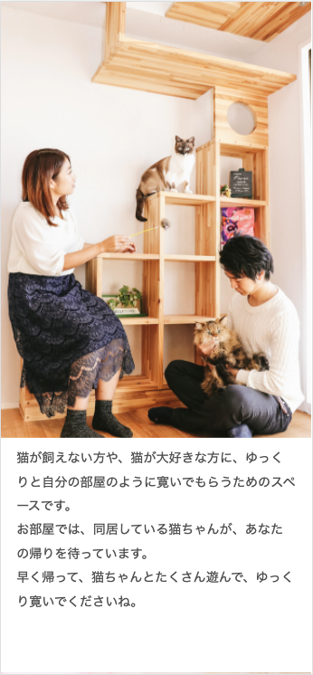
リード文の背景画像を調整

文章の背景を白色で表示するために、背景画像の表示場所を「#lead p」から「#lead」へ変更します。
「#lead」を1画面で表示するheight:100vhがポイントです。
/* リード文 */
#lead{
        padding: 65vh 0 0 0;
        background-image: url(../images/txtimg_1.jpg);
        background-position: center top ;
        background-repeat: no-repeat;
        background-size: 100% auto;
}
#lead p{
        width: 100%;
        padding: 10px 5% 40px 5%;
    /*  margin: auto;
    background-image: url(../images/txtimg_1.jpg);
    background-position: 100% 80% ;
    background-repeat: no-repeat;
    background-size: 385px auto;
    padding: 160px 410px 160px 0; */
        line-height: 30px;
        background-color: rgb(255,255,255);
}
「同居中の猫ちゃんたち」のレイアウトとデザイン
h2のデザイン修正と、Flexの4カラムから2カラムにレイアウト変更します。
h2のデザイン修正
h2{
        font-size: 21px;
    font-weight: bold;
    color: rgb(185,125,75);
    line-height: 150%;
    text-align: center;
        width: 90%;
    margin: 0 auto 30px;
    border-bottom: 2px solid rgb(185,125,75);
}
#cont-1>div,
#cont-3>div,
#cont-5>div{
background-color: rgb(255,240,235);
padding: 40px 0;
}
#cont-2>div,
#cont-4>div{
background-color: rgb(255,255,255);
padding: 40px 0;
}
paddingの調整は2カ所必要です
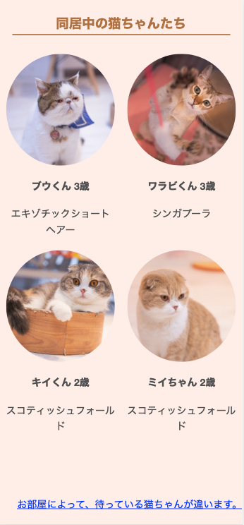
Flexを2カラムに変更
#cont-1 dl,
#room-container,
#info-container,
#open,
#access-container,
#cont-5 dl
{
        width:100%;
    /* margin: auto; */
    display: flex;
    justify-content: space-around;
        flex-flow: row wrap;
}
/* 同居中の猫ちゃんたち */
#cont-1 dl{
margin-bottom: 80px;
}
#cont-1 dl div{
width: 45%;
display: flex;
flex-flow: column wrap;
}dtとddの文章間の余白も調整が必要ですが、ここでは省略しています。
時間があれば、チャレンジしてみましょう !
「お部屋のご案内」のレイアウトとデザイン
Flexの3カラムを1カラムにレイアウト変更し、余白の調整
/* お部屋のご案内 */
#cont-2{
    background-image: url(../images/bg_2.jpg);
}
#cont-2 h2+p{
        width:100%;
    /* margin: 0 auto; */
    text-align: center;
    margin-bottom: 30px;
}
#room-container{
        padding: 0 5% 20px 5%;
    /* padding-bottom: 20px; */
}
#room-container section{
        width: 100%;
}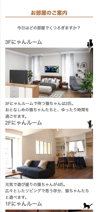
時間があれば、section間の余白も開けて、もっと見やすくしてみましょう !