これまで画像素材を作成して表現してきたデザインがCSSでできるようになってきました。
CSSでどんなデザインができるのか知るだけで、デザインの幅が広がります。
Contents
ボックスの角を丸くする
border-radiusプロパティは、境界線の角を丸くすることができます。
See the Pen Untitled by Rayout-gw (@Rayout-gw) on CodePen.
ボックスに影をつける
box-shadowプロパティは、ボックスに影をつけてボックスを浮かせて見せることができます。
box-shadowは、使い方次第で様々な表現が可能なので、便利なCSSジェネレータのサイトを使って作成すると良いでしょう。
値の記述は順番があり、オフセットX(横方向の位置)、オフセット(縦方向の位置)、ぼかし、広がり、色名の順で半角スペースで区切ります。
Statistics By Webcode Team Statistics JavaScript Statistics 2026 Paul MillsSepte…
webcode.tools
See the Pen 12-2-2 by Rayout-gw (@Rayout-gw) on CodePen.
猫カフェトップページでボックスのデザイン
同居中の猫ちゃんたちで正円切り抜き
<img>の画像を180pxの正方形にして、border-radiusプロパティで角丸、object-fitプロパティで切り抜き、object-positionプロパティで位置調整します。
    #cont-1 img{
       width: 180px;
       height: 180px;
       border-radius: 50%;
       object-fit: cover;
       object-position: top center;
    }
display:flexとorderで並べる順序を変える
display:flex;を使って並べたボックスは、orderプロパティで並べる順番を変えることができます。
#cont-1 dl div{
    width: 23%;
    display: flex;
    flex-flow: column wrap;
}
#cont-1 dt{
    order: 2;
    text-align: center;
    margin-bottom: 20px;
}
#cont-1 dd{
    order: 3;
    text-align: center;
    margin-bottom: 20px;
}
#cont-1 dd:last-of-type{
    order: 1;
    text-align: center;
}
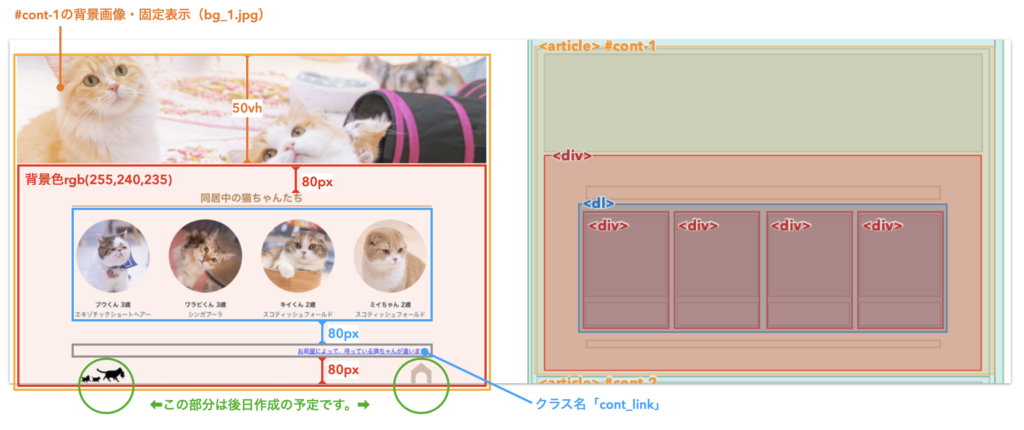
#cont-1の問題
図の指示に従って、#cont-1のデザインを完成させましょう。
#cont-1が<article>になっていますが、<section>が正解です!