
猫カフェトップページを使って、CSS Gridの作成のコツを学習します。
サイトでよく見られるデザインの作成について、理解することが目的です。
Contents
「お知らせ」のレイアウトを完成する
#cont-5の背景画像・背景色を表示
        #cont-1,
        #cont-2,
        #cont-3,
        #cont-4,
        #cont-5{
            background-image: url(images/bg_1.jpg);
            background-repeat: no-repeat;
            background-position: center;
            background-size: cover;
            background-attachment: fixed;
            padding-top: 50vh;
        }
        #cont-1>div,
        #cont-3>div,
        #cont-5>div{
            background-color: rgb(255,240,235);
            padding: 80px 0;
        }
背景画像を上書きします。
        #cont-5{
            background-image: url(images/bg_5.jpg);
        }
定義・説明リストをCSS Gridでレイアウト
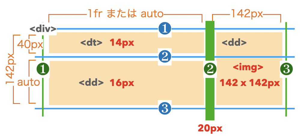
Gridコンテナの設定
        #cont-5 dl div{
            display: grid;
            grid-template-rows: 40px auto;
            grid-template-columns: 1fr 142px;
            column-gap: 20px;
            border-bottom: 1px dashed rgb(180,180,180);
            padding-bottom: 10px;
            margin-bottom: 30px;
        }
Gridアイテムの設定
        #cont-5 dt{
            font-size: 14px;
        }
        #cont-5 dd:first-of-type{
            grid-row: 2/3;
            grid-column: 1/2;
        }
        #cont-5 dd:last-of-type{
            grid-row: 1/3;
            grid-column: 2/3;
        }
写真を正方形にトリミング
        #cont-5 img{
            height: 142px;
            object-fit: cover;
            object-position: bottom center;
        }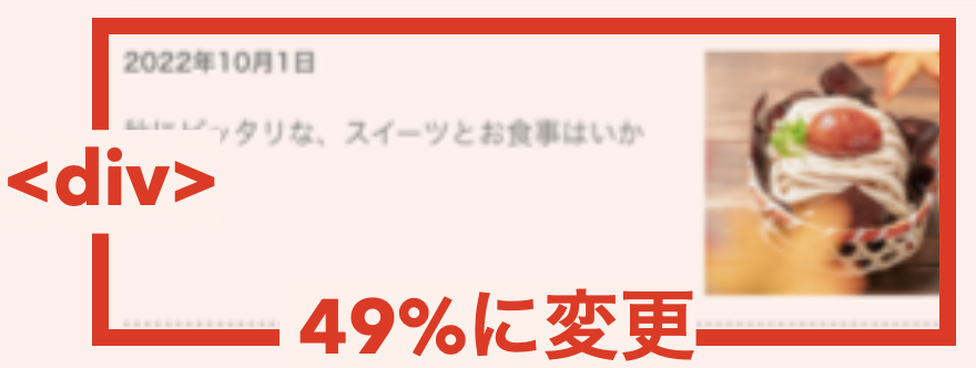
layout.css
#cont-5 dl div{
    width: 49%;
}
<footer>のデザインを完成する
        footer{
            background-color: rgb(210,180,175);
            padding: 40px 0 25px 0;
        }
        footer p{
            text-align: center;
            font-size: 14px;
        }
footerのデザインがこの講座のボーダーラインです。
これくらい出来るようになれば安心です。
ブロークングリッドに挑戦
グリッドのラインを引いて図が書けるようになるのが第1歩です。
セル・エリアを重ねると記述が違うので注意しましょう。
<header>のロゴ画像をCSS Gridでレイアウト
        header{
            background-color: rgb(210,180,175);
            display: grid;
            grid-template-columns: 1fr 280px 1fr;
            grid-template-rows: 80px 1fr 1fr;
            padding-top: 10px;
        }
        header>p{
            /* width: 316px; */
            /* margin: 0 auto; */
            grid-area: 1 / 2 / 3 / 3;
            z-index: 10;
        }
        nav{
            background-color: rgb(255,255,255);
            grid-area: 2 / 1 / 4 / 4;
            padding-top: 30px;
        }
4 , 5 , 11 , 16行目が「Layoutit!」のサイトで作成したコードです。
12行目のz-indexプロパティは、重ね順を変える時に使います。
固定ヘッダー・ナビゲーションに挑戦
        header{
            background-color: rgb(210,180,175);
            padding-top: 10px;
            display: grid;
            grid-template-columns: 1fr 280px 1fr;
            grid-template-rows: 80px 1fr 1fr;
            position: sticky;
            top: 0;
            box-shadow: 0px 1px 5px rgba(0,0,0,0.45);
        }
positionプロパティとtop・left・right・bottomプロパティを使うと、ボックスを自由に上下左右動かして配置することができます。
便利なんですが、正しく仕組みとルールを理解していないと、レイアウト崩れの原因にもつながります。
positionプロパティの中でも、ボックスをスクロールさせず固定表示できるfixedとstickyは、比較的安全に便利に使えます。
おまけ
See the Pen 16-4 by Rayout-gw (@Rayout-gw) on CodePen.
positionプロパティのFixedとSticky、z-indexプロパティを使ったサンプルです。
ちょっとしたパララックスデザインも作れますよ。
幕が上がって表示するようなフッターが特徴的です。